Shachihata Inc.
Shachihata Inc. offers a variety of stationery and office products that embody the communicative tools "inscribe, convey, acknowledge" with its core technology in pre-inked stamps and marking products.
We always try to meet customer's needs in terms of function and quality, and pursue designs that are attractive, that make for user comfort and that convey a sense of pleasure in ownership.
URL:http://www.shachihata.co.jp/english/index.php
Exhibit items

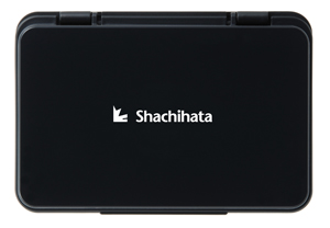
SHACHIHATA STAMP PAD
With just a glance at the colour of the body of the stamp pad the colour of the ink inside is recognizable. This square, glossy stamp pad brings together the images of the traditional Japan and modern stationery.
DESIGNER : NAOTO FUKASAWA

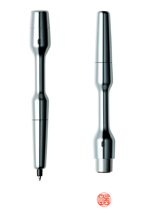
NAMEPEN SIGN
When you use the stamp, it looks like a stamp; when you use it to write with, it looks like a pen. That is the Namepen Sign, with just the one item, both actions can be carried out smoothly. Its unique form makes it easy to grip when both writing and bearing down on the stamp, something that has been achieved by making both functions equally important to the product.
DESIGNER : NAOTO FUKASAWA
VERMILION SEAL INK PAD
We have designed a "roundish square" shape with which both round and square stamps can be used, at the same time maintaining the image of the traditional vermillion ink pad. The unpleasant sensation experienced with the protrusion of the hinges has been resolved with their relegation to the outer circumference of the pad. The slightly swelled upper surface of the lid highlights the attractive glossy red and black of the cases.
DESIGNER: NAOTO FUKASAWA
DESIGN SHACHIHATA
We started the Design Shachihata project in 2005 in celebration of the company's 80th anniversary. With the cooperation of product designer Naoto Fukasawa, the project aims at establishing a product identity with a uniform image by raising the mark to a higher level with regards to the design of our flagship products.
With the key phrase of the project being "a brand you experience with your fingers", we have taken notice of the natural movements of the hands and fingers, how they work, and have aimed for designs that are as simple as possible and which meet various user applications.
For example, we have added a slight indentation where the user's index finger makes contact with the body of the stamp; this indentation functions as an indicator for the direction of the characters on the stamp, and this has been made a salient feature of the design.
We have aimed at the shared feelings users have when touching our products embodying the Shachihata brand and product identity. The colours and textures of the products are derived from the black and vermillion of traditional Japanese lacquer ware; products with new functions or which utilize new technology are thus shown to carry on from traditional stamps.
The Shachihata logo is derived from the two words that make up its name - "shachihoko", a mythical carp, an auspicious protector of well-being, and "hata", Japanese for "flag". The name pen, vermillion ink pad and the stamp pad have already been put into production, and have garnered Good Design Awards.
DESIGNER: NAOTO FUKASAWA